
Integrating Technology into an
Charts and Graphs
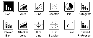
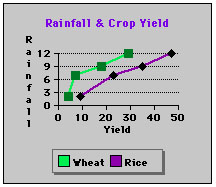
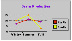
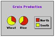
Several software programs are designed to present data in graphical form. Microsoft Excel and ClarisWorks take spreadsheet data and easily create any one of a number of charts or graphs with a few clicks of the mouse. Look at the different types of charts displayed below. Which ones would be suitable for the Boiling Point Project?
Chart and Graph Examples
|
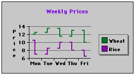
X-Y Line |
Line |
|
Pie |
Hi-Low |
|
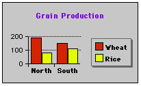
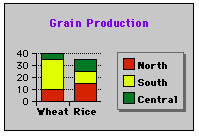
Bar |
Stacked Bar |
|
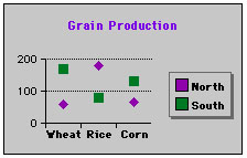
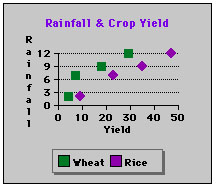
Scatter |
X-Y Scatter |
The Boiling Point
Previous Index Next
All work on this site ©Harold Olejarz 1997 - 1999 and the artists credited. No images or text may be used for commercial purposes without written permission from Harold Olejarz. Personal or educational uses are allowed with permission from Harold Olejarz.